2024-10-27
Reactでポートフォリオサイトを作成する 🚀(1)
ReactNext.jsポートフォリオ
はじめに
「自分にとって新しい技術をインプットしたい」と「長く残るアウトプットを作りたい」という思いから、Reactを使ってポートフォリオサイトの作成に挑戦してみることにしました。
この記事を含め、複数回に分けて作成過程を記録していきます。今回は以下の内容についてご紹介します。
- Nextアプリ作成
- サイト共通デザインの設定
- Headerの作成
- 【TOP画面】テキストアニメーションの作成
- 【TOP画面】メインメッセージ部分作成
- 【TOP画面】背景画像の設定
今回の開発環境は以下の通りです。
| 利用環境 | バージョン |
|---|---|
| macOS | Sonoma 14.5(M1チップ) |
| Node.js | 20.12.2 |
| React | 18 |
| Next.js | 14.2.5 |
| TypeScript | 5 |
| tailwindcss | 3.4.1 |
デザインの参考にするサイト(完成イメージ)
参考にした上記サイトやGithub Copilotを活用し、無事にポートフォリオを完成させることができました。本当にありがとうございます!
キャッチアップ方法
Nextアプリ作成
ターミナル
npx create-next-app@latestターミナル
Need to install the following packages:
create-next-app@14.2.5
Ok to proceed? (y)
yを入力してエンターを押し、続けて聞かれる質問には好みで答えます。
意味については以下を参考にしました。
ターミナル
✔ What is your project named? … my-site
✔ Would you like to use TypeScript? … Yes
✔ Would you like to use ESLint? … Yes
✔ Would you like to use Tailwind CSS? … Yes
✔ Would you like to use `src/` directory? … Yes
✔ Would you like to use App Router? (recommended) … Yes
✔ Would you like to customize the default import alias (@/*)? … No
ターミナル
cd my-site
npm run dev
この状態で
http://localhost:3000/にアクセスすると、初のnext.jsと対面できました。
page.tsxのreturn内とglobals.cssにいなくなってもらい、
Hello My Site!を表示させました。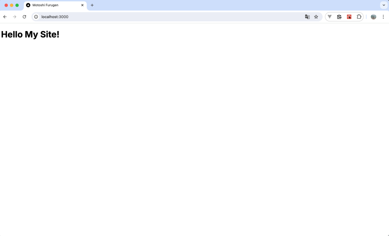
サイト共通デザインの設定
tailwindcssは、あらかじめ用意されたCSSクラスをタグに指定してスタイルを適用させることができます。利用方法は
tailwind.cssをimportして、適用させたいスタイルのクラスをclassNameを指定するだけです。page.tsx
import 'tailwindcss/tailwind.css'

export default function Home() {
  return (
    <body>
      <h1 className="text-black">Hello My Site!</h1>
    </body>
  )
}
ここでは、サイト全体で使用するカラーとフォントを
tailwind.config.tsに定義し、globals.cssでbodyにスタイルを適用しました。tailwind.config.ts
import type { Config } from "tailwindcss";

const config: Config = {
  content: [
    "./src/pages/**/*.{js,ts,jsx,tsx,mdx}",
    "./src/components/**/*.{js,ts,jsx,tsx,mdx}",
    "./src/app/**/*.{js,ts,jsx,tsx,mdx}",
  ],
  theme: {
    colors: {
      'bg-main' : '#F6F6F6',
      'font-main' : '#161616',
    },
    fontFamily: {
      'ryo-gothic-plusn': ['"ryo-gothic-plusn"', 'sans-serif'],
    }
  },
  plugins: [],
};
export default config;
globals.css
@tailwind base;
@tailwind components;
@tailwind utilities;
body {
@apply bg-bg-main text-font-main font-ryo-gothic-plusn;
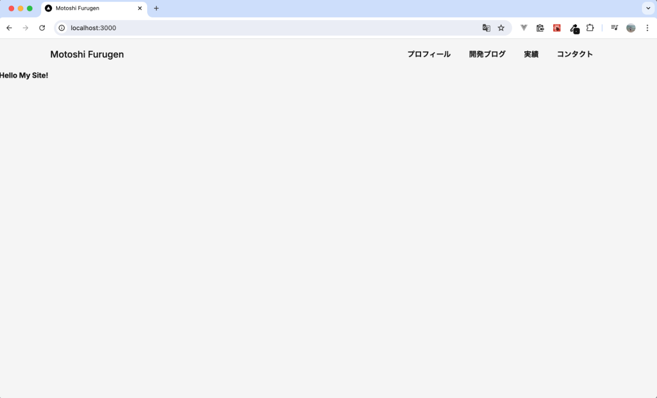
}Headerの作成
ヘッダー用に
components/Header.tsxを新規で作成しました。Header.tsx
import Link from 'next/link'
import 'tailwindcss/tailwind.css'

const Header = () => {
  return (
    <header>
      <div className="container mx-auto flex flex-wrap p-5 flex-col md:flex-row items-center">
        <a className="flex font-medium items-center mb-4 md:mb-0">
          <span className="ml-3 text-xl">Motoshi Furugen</span>
        </a>
        <nav className="md:ml-auto flex flex-wrap items-center text-base justify-center">
          <Link className="mr-10 hover:opacity-50" href="#">
            プロフィール
          </Link>
          <Link className="mr-10 hover:opacity-50" href="#">
            開発ブログ
          </Link>
          <Link className="mr-10 hover:opacity-50" href="#">
            実績
          </Link>
          <Link className="mr-10 hover:opacity-50" href="#">
            コンタクト
          </Link>
        </nav>
      </div>
    </header>
  )
}

export default Headerlayout.tsxでHeaderコンポーネントを呼び出しました。layout.tsx
import type { Metadata } from "next";
import { Inter } from "next/font/google";
import "./globals.css";

import Header from "./components/Header";

const inter = Inter({ subsets: ["latin"] });

export const metadata: Metadata = {
  title: "Motoshi Furugen",
  description: "This is Motoshi Furugen's personal website.",
};

export default function RootLayout({
  children,
}: Readonly<{
  children: React.ReactNode;
}>) {
  return (
    <html lang="en">
      <body className={inter.className}>
        <Header />
        {children}
      </body>
    </html>
  );
}
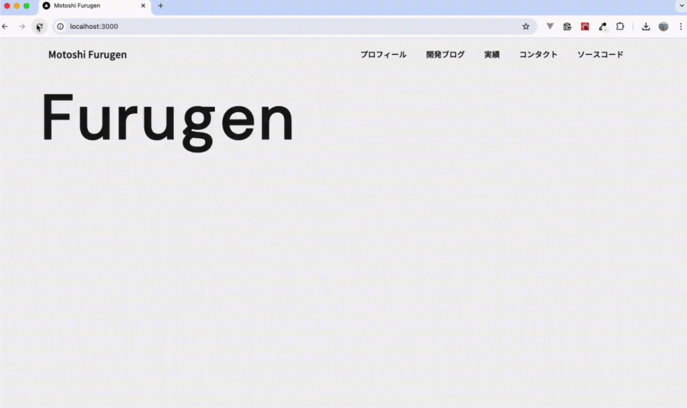
【TOP画面】テキストアニメーションの作成
TOPページのタイトルにどうしてもアニメーションを入れたかったので、GSAPを導入しました。
ターミナル
npm install gsapcomponents/TitleAnimation.tsxを新規で作成し、GSAPを使って文字を一文字ずつ表示させるアニメーションを実現しました。TitleAnimation.tsx
'use client'

import { useEffect, useRef } from 'react'
import gsap from 'gsap'
import { TextPlugin } from 'gsap/TextPlugin'

gsap.registerPlugin(TextPlugin)

export default function TitleAnimation() {
  // 文字を一文字ずつ表示するアニメーション
  const textRef = useRef < HTMLParagraphElement > null
  useEffect(() => {
    if (textRef.current) {
      gsap.to(textRef.current, { duration: 1.75, text: 'Furugen' })
    }
  }, [])

  return (
    <p
      className="
        w-full
        text-[8rem]
        text-left
        text-font-main
        font-dm-sans
        tracking-widest
        mx-[100px]
      "
      ref={textRef}
    ></p>
  )
}
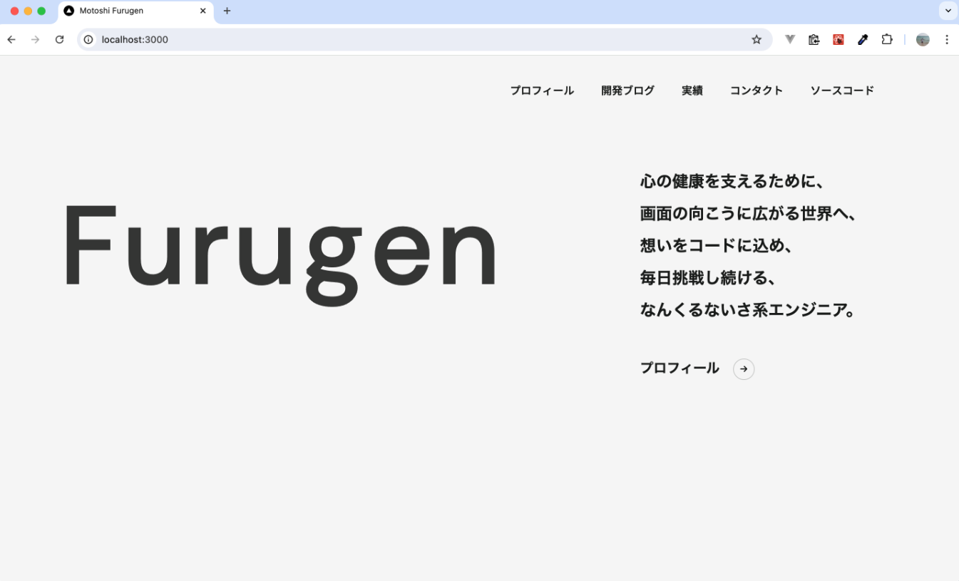
【TOP画面】メインメッセージ部分作成
components/MainMessage.txsを作成し、メインメッセージを記述しました。MainMessage.tsx
export default function MainMessage() {
  return (
    <>
      <p className="text-2xl leading-loose">
        心の健康を支えるために、
        <br />
        画面の向こうに広がる世界へ、
        <br />
        想いをコードに込め、
        <br />
        毎日挑戦し続ける、
        <br />
        なんくるないさ系エンジニア。
      </p>
    </>
  )
}page.tsxにて、TitleAnimationコンポーネントとMainMessageコンポーネントを横並びに表示しました。page.tsx
・・・
<section className="main-face flex">
  <div className="flex-1">
    <TitleAnimation />
  </div>
  <div className="w-[480px]">
    <MainMessage />
  </div>
</section>
・・・
アイコンを使いたいので、以下を参考にfont Awesome(無料版)を導入しました。
メインメッセージの下には、次回作成するプロフィール画面へのリンクを設置しました。
MainMessage.tsx
<>
  <p className="text-2xl leading-loose mb-12">
    心の健康を支えるために、
    <br />
    画面の向こうに広がる世界へ、
    <br />
    想いをコードに込め、
    <br />
    毎日挑戦し続ける、
    <br />
    なんくるないさ系エンジニア。
  </p>
  <a href="#" className="text-xl group">
    プロフィール
    <button
      className="relative align-middle transition-all w-8 max-w-[32px] h-8 max-h-[32px] text-xs border border-font-main border-opacity-20 rounded-full ml-5 group-hover:bg-white"
      type="button"
    >
      <span>
        <FontAwesomeIcon icon={faArrowRight} />
      </span>
    </button>
  </a>
</>
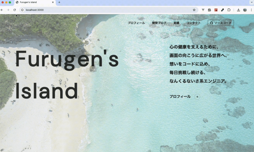
【TOP画面】背景画像の設定
トップ画面で大きく海の画像を載せたいと思い、背景画像用のコンポーネント
components/BackgroundWrapper.tsxを新たに作成しました。usePathname()を用いて現在のパスを取得し、トップページの場合のみ背景画像を表示させるようにしました。BackgroundWrapper.tsx
"use client";

import { usePathname } from 'next/navigation';
import React from 'react';

const BackgroundWrapper: React.FC<{ children: React.ReactNode }> = ({ children }) => {
  const pathname = usePathname();
  const isRootPath = pathname === '/';

  return (
    <div className="relative">
      {isRootPath && (
        <div className="absolute inset-0 bg-cover bg-center bg-no-repeat opacity-50 h-screen" style={{ backgroundImage: "url('/images/back-pic/day_01.jpg')" }}></div>
      )}
      <div className={`${isRootPath ? 'relative z-10' : ''}`}>
        {children}
      </div>
    </div>
  );
};

export default BackgroundWrapper;layout.tsxでbody内の要素をBackgroundWrapperコンポーネントで囲い、トップ画面にドーンと表示させました。layout.tsx
<html lang="en">
  <body className={inter.className}>
    <BackgroundWrapper>
      <Header />
      <main className="pt-40">{children}</main>
    </BackgroundWrapper>
  </body>
</html>
なんか文字のアニメーションがバグみたいに見えてきたので(笑)アニメーションの速度を調整して、トップ画面の実装が完了しました。
to be continued...
次回はプロフィール画面の作成を行います。